Exclusive Cover Reveal of “Ominous Music Intensifying” by Alexandra Teague

Electric Literature is pleased to reveal the cover for the poetry collection Ominous Music Intensifying by Alexandra Teague, which will be published by Persea Books on October 1, 2024. Preorder the book here.
In poems that swirl together traditional American patriotic music with current horrors—from gun violence to climate change—and in which Yeats’ famous apocalyptic figure of the Rough Beast takes a painting class, wears a spacesuit, and listens to public service announcements, Ominous Music Intensifying takes on the too-muchness of contemporary, apocalypse-prone America with its own hard-hitting music, dark humor, and the occasional fiddle duel. Teague expands her subject matter here to include chronic pain, generational poverty, and questions of safety—bodily and psychological—as she writes letters to Mitch McConnell about UFOs (and everything else), reckons with sexism and dental trauma, torture devices and sad clown paintings and the pandemic, asking “What kind of safety, breaking apart to make us?â€
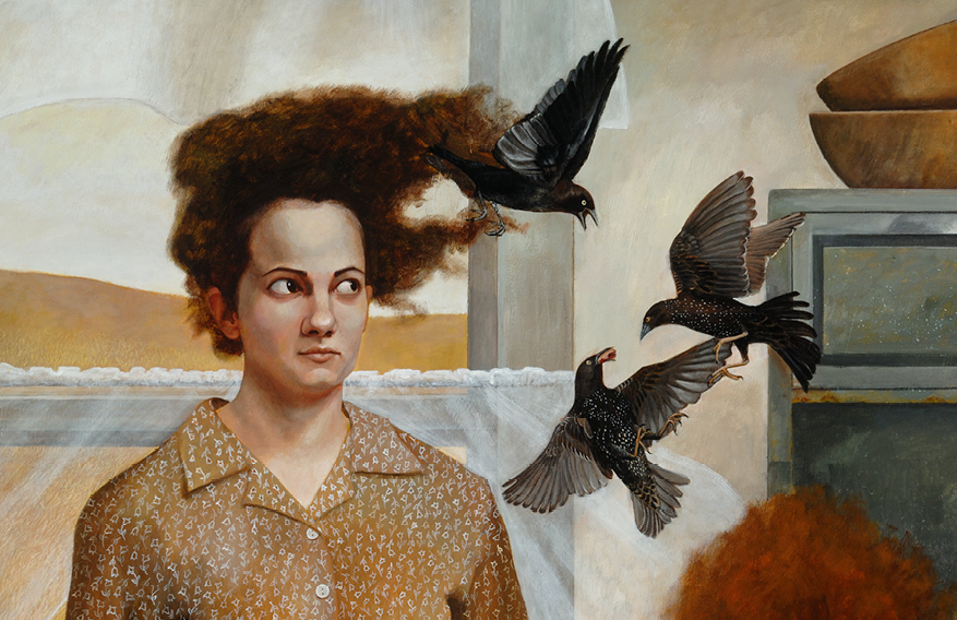
Here is the cover, designed by Dinah Fried of Small Stuff Design, artwork by Andrea Kowch.
Author Alexandra Teague: For months after I first ran into this Andrea Kowch painting, I couldn’t get it off my mind. While the women and crows weren’t directly characters in my poems, they existed in the poems’ same emotional landscape: ominous, askew, maximalist Americana—with maybe fiddling or off-key patriotic songs drifting in the window from the desolate gold fields. The painting asks us to reconsider what is beastly, what’s domestic, what’s safe, what’s homey. It’s a fairytale-real landscape into which the Rough Beast could slouch, as he does into my poems, moving from Yeats’ famous “The Second Coming†into contemporary scenes of gun violence and pandemics and climate change. A landscape that suggests both strange humor and danger; order and incongruity; allegory and real apocalypse. I’m so grateful we’ve been able to use Kowch’s “The Visitors†to invite readers into the kitchen (please grab a thrift store chair and don’t mind the hyena) for some poems and pie.
Designer Dinah Fried: From a design perspective, our primary goal was to allow the haunting and evocative painting (“The Visitors†by Andrea Kowch) to express the tone of the cover, and not let our design decisions distract or compete with it. In that spirit, the stark white cover and unadorned black typography are meant to be a quiet counterpoint to the visual and emotional richness of the image with its bleak landscape; piercing stares; voracious animals; chaotic tabletop; flaming red hair; and glistening, ripe berries. We chose the typeface Eagle Bold—originally designed by Morris Fuller Benton in 1933 for FDR’s National Recovery Administration (part of the New Deal)—as it felt as if it might have existed in the same time and space as these three windblown bakers.
Read the original article here


